 |
| Original Photo: Nikon D5100, f/5.2, 1/608sec, 18-55mm lens |
Thursday, 31 May 2012
Cyanotype!
Wednesday, 30 May 2012
Gel Acrylic Lift: The Journey
 |
| Original Photo: Nikon D5100, f/9, 1/320sec, 18-55mm lens |
 |
| Nikon D5100, f/5.6, 1/20sec, 18-55mm lens |
This alternative process was definitely the most easy of all the ones I choose to do. The two pictures I used express my theme, the journey. The map is self explanatory, and has a added bonus since it's of Oakville; I can actually use it. The penguins represent the journey in so many ways as well. Every year, emperor penguins (mostly males) in Antarctica must leave their habitats and go on a horrendously long and cold journey inland to gather food for their hatching chicks. No food recovered means their chick will not survive. This famous journey can be seen with incredible detail in the movie March of the Penguins, feel free to check it out. 12 layers of gel was used on each gel lift.
Wednesday, 16 May 2012
Breaking the Rules like a Rebel
 |
| Nikon D5100, f/8, 1/120sec, 18-55mm lens |
 |
| Nikon D5100, f/3.5, 1/65sec, 18-55mm lens |
 |
| Nikon D5100, f/8, 1/260sec, 18-55mm lens |
 |
| Nikon D5100, f/7.1, 1/220sec, 18-55mm lens |
I personally really enjoyed this project. At first, it seemed
quite impossible to break the rules while making the picture look good at the
same time but later I realized almost every photo broke the rules in some way,
the hard part is identifying it. My inspiration, probably like many others, was Annie Leibovitz. I really liked how incredibly different and individual every piece of her work is. While working on this project, I had two of her pictures in mind that were shown in class. One was of a lamp and a couple facing away from each other on either side of it, and the other was of the two cars with a party or meeting of some sort occurring in the space between it.
The first photo breaks the rule of merging and
balance(symmetrical). The roofs are actually where giraffes feed from. I thought this was an awesome merger because the roofs almost act as umbrellas on Sam and Rachel's heads. Also, the roofs are balanced, but the change in Sam and Rachel's height makes the photo unbalanced.
The second picture breaks the rules of balance (asymmetrical) and the rule
of thirds. The main focus of this photo is somewhat hard to identify, but I would say it's most likely the man walking. The rule of thirds is broken because he is in the center of the picture. In addition, the open train door opposed to the closed door on the opposite side creates an unbalanced photo.
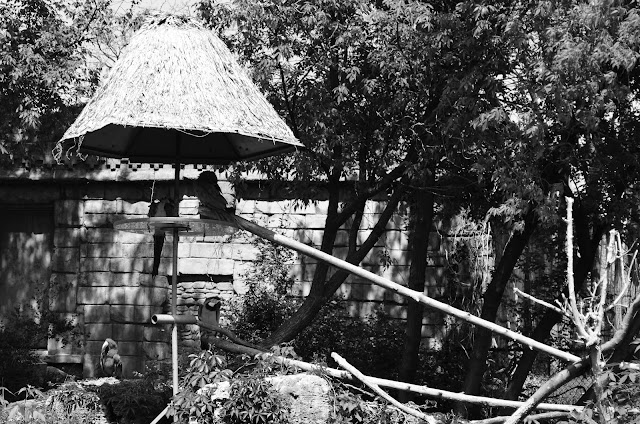
The third photo breaks simplicity and just barely, the rule of thirds. All the trees and bricks in the background make it hard to identify the subject of the photo at first glance. It has bad framing as well, as the objects surrounding the picture do not direct the eye to the birds.
The last photo breaks the rule of thirds, balance and merging. The mother duck is terribly merged to the bench seat and the little ducklings do not balance with their mother ducking. :(
Subscribe to:
Comments (Atom)