Sunday, 3 June 2012

Robert Doisneau, My Photo Mentor

“A photographer who made a picture from a splendid moment, an accidental pose of someone or beautiful scenery, is the finder of a treasure.” – Robert Doisneau

Every photograph records perhaps a hundredth of a second. Take around one hundred photographs and you get about one second of moments, one second of recordation of what happened. In order to make that one second a significant one, all the right moments must be recorded at the right time. That is why timing is everything. Robert Doisneau of Gentilly, France was one of many to spend his life perfecting the art of timing to capture all the right moments. His journey lead him to become a pioneer of photojournalism and his street photography became icons for Paris and other photographers during his time. His work is among the most recognizable of all French photographers.

Doisneau captured life in Paris not the way it was, but the way he wanted it to be like at all times. He saw Paris as the place of mingling social classes, children roaming free of their parents, art, music and of course, young love. His one of a kind photograph, Le baiser de l’Hotel de Ville (also known as The Kiss) was particularly famous with its representation of love in Paris. Although this picture was set up, it is still so realistic and a deep sense of passion and love can be felt. It may be even better than if it were a candid shot.  This photograph came to be an international symbol of love in Paris. Although in reality, the couple only stayed together for 9 months, the picture gave them an infinite look. it is still one of the most iconic images of the 20th century and has lost none of its romantic character. His photographs makes anyone love Paris and her people. He makes one wish they lived in Paris in the duration of time he was there.  Many of his other photographs represented and symbolized life in France as well. Calendars and post cards are made with his pictures even decades after he had deceased.

"Le Basier de l'Hotel de Ville"

As Doisneau always said, “The marvels of daily life are so exciting; no movie director can arrange the unexpected that you find in the street.” All of his photos were taken by his Leica through wandering the streets of Paris during day and night. He showed how wondrous the streets are, as well as how eventful and exciting they can be. Doisneau proves that you don’t need some mystic setting nor a huge event to find humanism; the simple and obvious streets is more than enough. So much magic happens on the streets, every second of everyday, it just takes an open eye and mind to see beyond the normality. Moments occur everywhere, every millisecond. Some moments he captured are so impeccable.

"Musician In the Rain"

Doisneau was one of the first pioneers of photojournalism along with Henri Cartier-Bresson. Without them, who knows where photojournalism would be in the present day. He recorded some visual history of Paris that in any other case could have remained unknown forever. His pictures record the beauty of being in the right place at the right time. Every last picture he took contains at least one main and clear emotion. He gave history such a great social record of the people, places and culture of Paris from the 1930s to the 1980s. He also gave photojournalism a new insight –  to record the greatest of. Not a single piece of his photograph is associated with sadness or anything unhappy in general.  He sees the potential of the streets as his reality. The world he showed through his photographs was one where he could feel tender in, where everyone is friendly and themselves.


Robert Doisneau was very successful and achieved a lot in his life. He experimented with many kinds of jobs but in the end united with his passion, photography. He was able to give the streets Paris an identity that holds strong for the rest of its existence, while giving the world a new perspective of photojournalism. Whether his subject is of something extraordinary or just plain ordinary, Robert makes it look fantastic. Every photograph he took represents him in so many astounding ways. You can almost see the shy and humble man behind the photograph. 
  
 In the mentor project, I tried to think in the mind of Robert Doisneau and wandered the streets of Toronto, while taking pictures of Toronto the way I would like to see it on a daily basis. I see Toronto as a safe and friendly place where people are not afraid to be their complete selves. It represents individualism, but people are united as just as much. People are expressive through art and music everywhere. These 2 photos capture a single day in Toronto. 


Nikon D5100, f/5.6, 1/60sec, 18-55mm lens

Nikon D5100, f/10, 1/200sec, 18-55mm lens

Works Cited
"Atelier Robert Doisneau." Atelier Robert Doisneau. Web. 05 June 2012. <http://www.robert-doisneau.com/fr/robert-doisneau/biographie/>.
"Masters of Photography: Robert Doisneau." Masters of Photography: Robert Doisneau. Web. 05 June 2012. <http://www.masters-of-photography.com/D/doisneau/doisneau_articles2.html>.
"Robert Doisneau." WHO. Web. 05 June 2012. <http://www.who.int/features/2009/photoarchives/doisneau/en/index.html>.
"Robert Doisneau (French Photographer)." Encyclopedia Britannica Online. Encyclopedia Britannica. Web. 05 June 2012. <http://www.britannica.com/EBchecked/topic/168066/Robert-Doisneau>.

Saturday, 2 June 2012

Yin and Yang: Silk Screen

Nikon D5100, f/3.5, 1/50sec, 18-55mm lens

Nikon D5100, f/3.8, 1/40sec, 18-55mm lens

My inspiration for this project came from the floor of the art room. Best place of inspiration yet! I spotted a yin and yang sign that someone had silk screened on there and immediately wanted to do something with that sign. I had also gone on a field trip to the zoo lately and had tons of animal pictures, so I thought that was a great way to incorporate my photography into the symbol.

On the original symbol, the black side with the white dot is Yin. It represents things like slow, soft, cold, wet, water, and femininity. I thought a flamingo portrayed Yin well. The other side (white with the black dot) is Yang, which characterizes the opposites: fast, hard, solid, hot, dry, aggressive and is associated with masculinity. I used a rhino to represent Yang.

I think this symbol represents pretty much everything quite well. For example, people can be hard and as stubborn as a rhino, but there is always is always a little pink flamingo in them. 

Thursday, 31 May 2012

Cyanotype!

Original Photo: Nikon D5100, f/5.2, 1/608sec, 18-55mm lens
I took this picture on a plane home from Boston. It posed as the perfect picture use for this process because  the blue colouring effect of the cyanotype. Although it took away a lot of the picture's contrast, the navy colour makes the picture pop and the sky look wondering. I really love the old effect this process created as well as the texture it adds to the clouds. This was such an interesting way of "developing" a photo and something I would most definitely try again.

Wednesday, 30 May 2012

Gel Acrylic Lift: The Journey

Original Photo: Nikon D5100, f/9, 1/320sec, 18-55mm lens

Nikon D5100, f/5.6, 1/20sec, 18-55mm lens


This alternative process was definitely the most easy of all the ones I choose to do. The two pictures I used express my theme, the journey. The map is self explanatory, and has a added bonus since it's of Oakville; I can actually use it. The penguins represent the journey in so many ways as well. Every year, emperor penguins (mostly males) in Antarctica must leave their habitats and  go on a horrendously long and cold journey inland to gather food for their hatching chicks. No food recovered means their chick will not survive. This famous journey can be seen with incredible detail in the movie March of the Penguins, feel free to check it out. 12 layers of gel was used on each gel lift.

Wednesday, 16 May 2012

Breaking the Rules like a Rebel

Nikon D5100, f/8, 1/120sec, 18-55mm lens

Nikon D5100, f/3.5, 1/65sec, 18-55mm lens

Nikon D5100, f/8, 1/260sec, 18-55mm lens

Nikon D5100, f/7.1, 1/220sec, 18-55mm lens

I personally really enjoyed this project. At first, it seemed quite impossible to break the rules while making the picture look good at the same time but later I realized almost every photo broke the rules in some way, the hard part is identifying it. My inspiration, probably like many others, was Annie Leibovitz. I really liked how incredibly different and individual every piece of her work is. While working on this project, I had two of her pictures in mind that were shown in class. One was of a lamp and a couple facing away from each other on either side of it, and the other was of the two cars with a party or meeting of some sort occurring in the space between it. 

The first photo breaks the rule of merging and balance(symmetrical). The roofs are actually where giraffes feed from. I thought this was an awesome merger because the roofs almost act as umbrellas on Sam and Rachel's heads. Also, the roofs are balanced, but the change in Sam and Rachel's height makes the photo unbalanced. 

The second picture breaks the rules of balance (asymmetrical) and the rule of thirds. The main focus of this photo is somewhat hard to identify, but I would say it's most likely the man walking. The rule of thirds is broken because he is in the center of the picture. In addition, the open train door opposed to the closed door on the opposite side creates an unbalanced photo. 

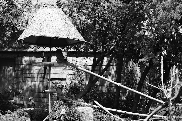
The third photo breaks simplicity and just barely, the rule of thirds. All the trees and bricks in the background make it hard to identify the subject of the photo at first glance. It has bad framing as well, as the objects surrounding the picture do not direct the eye to the birds. 

The last photo breaks the rule of thirds, balance and merging. The mother duck is terribly merged to the bench seat and the little ducklings do not balance with their mother ducking. :(

Wednesday, 18 April 2012

Mixed Lighting


Nikon D3100, f/20, 1/20", 18-55mm lens
In this photo, natural light and a reflector was used. The sun created a glare and light rays on the window that I loved. The reflector was used to make the side of Jasleen's face that was facing away from the sun brighter. This picture was taken in one of the stairwells at the side of the school. It looks like she's bathing in light, without actually being surrounded by light. My inspiration was Julie Harris again and my goal was to be able to illuminate people with light like her. This didn't really work, but if I had used a studio light on Jasleens face, it could have turned out better. I also liked this assignment because every picture was beautifully lighted due to having multiple light sources. I felt that the pictures in this  turned out better than the ones for studio lighting because the studio lighting lacked white light, and gave all the pictures a yellow tint. Overall this assignment was awesome due to the awesome results, and it also taught me how to fix the dark faces in pictures where a person is facing away from the sun. 

Sunday, 15 April 2012

The Jas Player

"The Jas Player"
Nikon D5100, f/5.3 1/15", 18-55mm lens


The Renaissance was a very important cultural and intellectual movement that is considered to have originated in Northern Italy during the late 1300's and then spread to England, France, Germany, the Netherlands, Spain and many other countries throughout the 1400's. The word Renaissance itself means "rebirth" or "reconstruction" in French. This movement did in fact live up to its name. It not only induced the rebirth of culture and civilization, but it also led to the rediscovery of spirit and enlightenment that still exists with humans today. With Gutenbergs development of printing, Christopher Columbus's unearthing of North America, and Copernicus new found information of the Earths rotation around the sun, the era definitively marked a time of discovery.


The Renaissance Era did not only see to scientific growth and development, but brought a great transformation to art history. Art had difficulty remaining significant throughout the Middle Ages (a.k.a. the Dark Ages) due to expanding territory struggles in Europe - people had more important things to worry about, like staying alive, than making time for creativity or originality . The Renaissance art back into Europe with a huge boom. Through experimenting with new mediums, artists created a bigger and brighter sense of light and colour in their art. Creating a sense of space was also increasingly popular at the time, due to the three-dimension factor it achieves. It was also the handwork of artists that made the most commissions. Artists created more work that expressed their freedom and individuality as celebration to the end of the Medieval times. Art was forming into more than just a hobby or a craft during the Renaissance.


Italy plays an enormous part to the Renaissance. Two particular Italian artists of this time have merged themselves forever into art history with their astounding creation of paintings and sculptures: Leonardo da Vinci and  Michelangelo. Like most Renaissance artists, both had one main focus in mind while creating art: natural objects for Da Vinci and the human anatomy for Michelangelo. The most well known works of these artists are the Mona Lisa and David, both still existing along the worlds most well known painting/ sculpture many centuries later, and countless centuries to come.  

Michelangelo Merisi da Caravaggio was also an artist who originated from Italy, but he was more apart of the Baroque period than the Renaissance. He is a very realistic painter who preferred to work with his own controversial painting method. He rejected the traditional Italian ways by using oils directly from the subject in his art, but his art was so intensely filled with realism that it made an everlasting impact on every artist who saw them. Caravaggio paints the physical and emotional state of humans upon severe examination, with a forcible use of lighting. Although he aimed for total realism, he craved for drama in his art, and seemingly his life as well. He was largely successful in Rome, named "Most famous painter in Rome", but he always appeared to be in some form of trouble, whether it was attacking a police officer or even being involved with murder. Within a mere time spam of six years, Caravaggio had been to none less than 11 trials, and fled from Milan to Rome. 


"The Lute Player" was painted by Caravaggio in 1596, during his earlier period of experience with art just after he fled from to Rome. He had an interest in painting still lives then, such as images of musicians with instruments like this one. The  model who poses for this painting was a friend of Caravaggio's and appears in many of his other paintings as well. In this painting, the boy is in the middle of singing a song about love and plucking a note on his lute. There are three versions of this painting, all with the same boy but adjusted amount of lighting, shadows and sometimes different background objects. This particular particular version is currently located in the Hermitage Museum in Russia. Caravaggio's use of strong shadows created a huge amount of contrast in his painting, and accentuates the subject of the painting. His is so attentive to detail that the music sheet in front of the boy actually contains notes to a certain song.  


The lighting of this painting was very hard to match. It was especially the dark shadow on the right cheek of the boy's face I couldn't get dark enough, without making the lighter side too dark as well on Jasleen. To get the shadows on Jasleen's face, a lamp was posted high above Jasleen on my left hand side facing down and another lamp farther away, also on my left, on the ground casting a shadow up on her face. My inspiration for this photo was to match Caravaggio's shadow technique in his original painting by using shadows to enhance and contrast the models face as well as recreate the same angry, yet smiling face of his model. However, the shadow on the neck of the boy did not match the shadows on his face. Since I only copied the shadow of the face on Jasleen, her face did not look like it is apart of the boys neck. I realized this afterwords, or I would've matched the lighting with the boys neck instead. 

Sunday, 8 April 2012

Painting With Light: Eyes of an Infant

"Dancing  With the Stars"
Nikon D5100, f/25 25", 18-55mm lens

"Big Bright Thing"
Nikon D5100, f/22 30", 18-55mm lens
"Pee-Ka-Boo!"
Nikon D5100, f/4.5 15", 18-55mm lens

I have never experimented with more factors than I did for this project. There was always a constant flow of new ideas and things to try that a time period of one week could not fulfill. For this project, my inspiration was the point of view of young children, since I felt that painting with light was free and colourful, not unlike a child's mind. Although this assignment took a ton of attempts and whole lot of patience to get right, it was really fun and I finally learned how to make the painting with light pictures I've seen all over the internet. The hardest part for me was thinking of  an idea to expand on; I didn't want to make the cliche drawings of names/words, infinity signs and  etc, that anyone could find all over Tumblr. The first picture was created with a thin flashlight, with the light facing the camera; the second had a bigger flashlight and same direction, but covered with different tissue paper to create the different colours. The last picture was created with three constant flashes from another camera, while making the three arm motions. I felt that I could have made all three pictures more intriguing.


Friday, 30 March 2012

Studio Lighting


Getting three what seemed like simple pictures for this studio lighting assignment took a much longer time than I had imagined. But after several sessions, a whole lot of  models and a few tons of hilariousness shots, I finally found a few shots I was super happy with. All pictures were taken with a Nikon D5100 and AF-S NIKKOR 18-55mm lens. My inspiration and for this project was Julie Harris and my goal was to capture natural moments. To do this, I didn't tell my models what to do, and let them choose for themselves.

The model for the first picture was Jasleen. For this candid (subject unaware) shot, the light placed to my immediate right and Jasleens turned head created the 1:0 light ratio. I felt that the lighting worked very well in the picture because the dark side of her face complimented and illuminated the lighted side of her face (specifically the cheek). This picture portrays the maturity Jasleen acquires so well. In addition, Jasleen's own added expertise made my job a whole lot easier and overall, this shot was an easy choice and is my favourite of the three. (Aperture: f/5, shutter speed: 1/60).

The second shot, a posed (formal), is of Jacqueline. My goal was to capture an innocent and simple photo like my inspiration. I like  Jacquelines somewhat shy smile as well as the simplicity and innocence of the entire picture, especially from the reflected light in her eyes. The 2:1 lighting ratio was created by two lights and Jackie's hair. One light (to my left) was placed closer to Jackie while the second light (on my right) was placed twice the distance away than the first. (Aperture: f/5, shutter speed: 1/60).

The last picture is a candid (subject unaware) of Rachel. I had taken over 60 shots of her in total, all very different. Her awesome natural smile made it very hard to choose just one picture to post. The naturalness of this shot and of her smiling at something funny that was happening behind me made this shot better than all the others. The 1:1 lighting ratio also gave her eyes an awesome sparking touch. (Aperture: f/4.5, shutter speed: 1/60).


Friday, 9 March 2012

What's In a Name?


The "Y" was found in the trees located in the school atrium. The "I" was found in the in boundary of two bricks, also in the atrium. I actually found the "W" first, as I was walking out the art class to the Devils Pit area. I had thought it would be the hardest letter for me to find, but apparently it wasn't. The "U" was found while walking around the front of the school in the garage of a house across the street. It had to be flipped vertically, but it makes an awsome "U". Since my name is super short, I had more time to focus on finding the best letters I could find, and time to experiment with aperture and shutter speed, etc, while taking the picture.

This project started out as a simple project where you find a few simple letters to make a name, but after this project I continued to notice letters everywhere in the environment and in places where I am everyday. It made me pay more attention to the details of my surroundings, and overall it was a fun project to work on.

Friday, 2 March 2012

My Favourite Photographer

Ansel Adams is definitley one of my top favourite, if not my top, photographers. He captures pictures and moments in the world in a way that are breathtaking and wows anyone who sees them.  I admire not only his photos, but him as a person too. He is an environmentalist who makes an effort to preserve his country's land through capturing and spreading the beauty of it. He is an incredible artist, as well as original in his imagination. 
File:Ansel Adams - National Archives 79-AA-E23 levels adj.jpg


Adams photography expresses freedom and a whole new perspective of the earth and its beauty. Every detail in his work is crucial and a wonder to look at. It is a pleasure to look at his work. He inspires me to be more aware of my surroundings and try and capture new perspectives in my work. To find out more about him, visit his site, where you can view his artwork, or his Wikipedia page